
How To Set Up Your Office For Color Grading
Learn how to pick the best lights, paint, & tools to make sure you're set up for proper color grading.
After about 10 years of ignorance and/or laziness I FINALLY got intentional with how I set up my new office to make sure that it was an accurate environment for color correction and color grading. Check out the video above to see how I did it.
(If you think I'm terrible on camera and/or just want some of the bullet points, continue reading on...)
If you're fortunate enough to be reading the text on this screen, you know how easy it is to take for granted the incredible eyesight that God has gifted you. Our eyes can adjust to practically anything - a dark room, sunny outdoors, and even crappy Matrix level office lighting.

The problem with this is that the technology we're dealing with - cameras, lights, computer monitors, etc. - aren't nearly as adaptable as our eyeballs, so in order to make sure we're seeing the colors in our videos accurately we need to bring our eyeballs down to a playing field that is level with our equipment.
While there are some new technologies that adapt to different lighting (I'm looking at you iPhones with your fancy Night Shift and True Tone modes), the majority of our computers that we're editing and color correcting/grading our work on have a color temperature of 6500K (you're church's projectors and TV monitors should be 6500K as well). With that being the case, the closer you can get your editing environment to also be 6500K, the more accurate you'll be able to view the colors on your screen.
Now some of you might be jumping ahead and saying to yourself, "What does it matter if people are going to be watching my videos on all sorts of different screens in different lighting conditions?". While that is certainly true, as the original creator of the content it's important that your work at least starts off exactly as you originally intended it - that your reds are red, your whites are white, and that you're blues are, uh, blue....?

Over the years I've edited and color graded my films in all sorts of different environments, but since I recently moved into an office that was all mine, I took a page from professional colorists and dialed in my entire environment to be as accurate as can be I could afford.
Here's what I did:
Step #1 - Adjust My Room Lighting
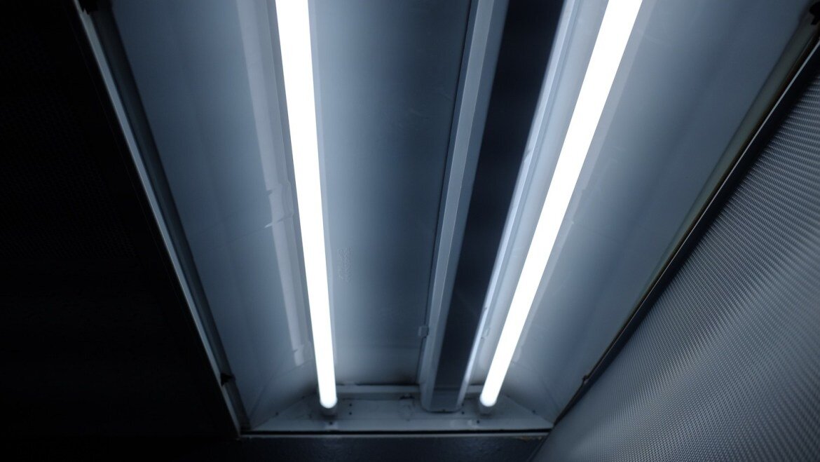
In my office I have no outside windows and I have two overhead fluorescent lights and a lamp from IKEA that I stole from my living room at home. If I had to guess, the overhead fluorescents are around 4100K with a nasty dose of green hue and my IKEA lamp had super warm tungsten bulbs (cause I replaced the ones that came with it) that were probably about 2800K to create those nice warm moody vibes so I can feel extra creative. Add my 6500K iMac display into the mix and we've got a pretty grody casserole cooking up in my office.
The problem that I mentioned before though is that my eyeballs are so good that they tricked me into thinking my office looked fine. It wasn't until I swapped out all of the lightbulbs in my office to very high quality 6500K bulbs that I realized just how off it was. Don't believe me? Look at this before and after:


Now by switching to 6500K bulbs you'll be in much better shape, but if you really want your space to be dialed in, you'll want to make sure you're using bulbs with a CRI of over 90 (and preferably above 95). These types of bulbs usually aren't found at your local Home Depot which is inconvenient, but after scouring the web I want to share the best bulbs I was able to find.Both my overheard bulbs and the ones I put inside my IKEA lamp came from Waveform Lighting and they did not disappoint.


Step #2 - Paint The Walls
Just like how lighting sources can effect how we process colors, the colors of our surroundings also effect how we perceive color. So if you want a color accurate environment the goal is to pick the Switzerland of paint colors - spectrally flat N5 matched paint - aka 18% neutral gray. By doing this you can eliminate or greatly reduce simultaneous color contrast when looking at your computer monitor.
If you're loaded with cash and want the best of the best you can buy this paint, or if you want to save some $$$ like me, you can take the following recipe down to Home Depot and get pretty close to the same thing:

(recipe courtesy of Flanders Scientific Inc.)

If you want to go all the way (like me) you can paint your entire room this color, but it's most important to have this color around the wall(s) that are around your computer monitor. Assuming that you're not color grading 100% of the time, you can definitely paint the rest of your room a different color, just be mindful of how the lights in your room are bouncing off of your hot pink accent wall when it comes time for video editing/color grading. A safer bet would be to stick to neutral colors for your other walls and tweak your room lighting when it's time to color grade so you're not bouncing all sorts of hues onto your monitor area.
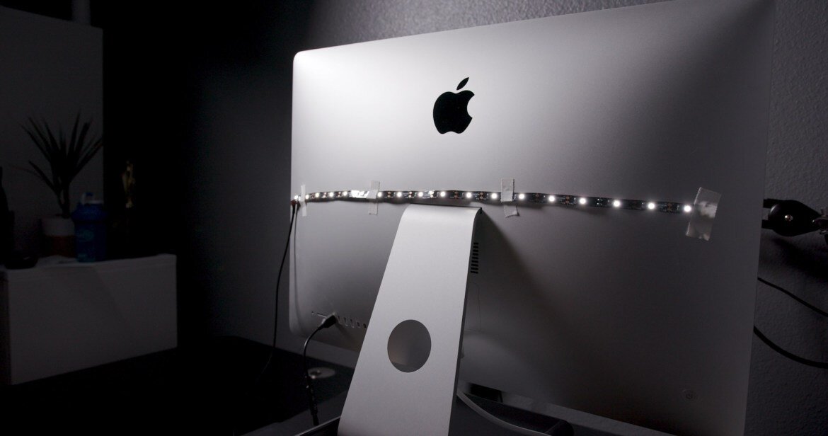
Step #3 - Add Bias Lighting
You may know about the bias that your least favorite cable news channel has, but do you know about bias lighting? In short, bias lighting is a soft light source behind your computer (or TV) that helps you perceive the contrast and colors of your monitor more accurately and prevents eye fatigue and all the problems associated with it (headaches, bad eye sight by the end of the day, etc.).
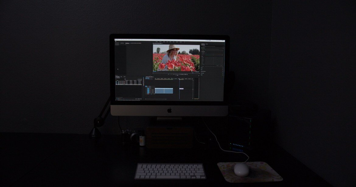

There are a lot of options out there to choose from, but for my computer I chose the MediaLight 6500K Bias Light. It is 6500K color temperature, has a CRI of 95, powers off your computer's USB port, and has a little controller to dial in the brightness how you want it. Depending on when you read this article you may be able to use the coupon code "Save20" to get 20% off your purchase. If that doesn't work for you, you should get a pop-up with another coupon if you visit the page I linked to and then move your mouse over like you're going to close the window.
The MediaLight Bias Light is a LED strip that comes with adhesive backing so you can stick it right to your monitor, but because I have commitment issues, I chose to use some gaff tape to hold mine up.
One thing that I like about this light being USB powered is that when I turn my computer off it turns off. One thing I don't like about it is that it takes up one of my USB ports - even trade I guess?
Step #4 - Calibrate Your Monitor
I think if you were going to cut corners, I'd at least do this step and then turn off all of your lights when it's time to color grade (and then ask your eyes for forgiveness for not giving them bias lighting). While there are a few affordable tools on the market to calibrate your monitor, the only one I would recommend is the X-Rite iDisplay Pro Monitor Calibrator and I would also avoid using their software that comes with the calibrator and use the "free" open source software DisplayCal. I call it "free" because it's free to download, but I would encourage you to leave a donation to help support the good people that created and update this software.
There are many reasons for the iDisplay Pro + DisplayCal combo, most of which are laid out here in this article by photographylife.com, but in short I did a lot of research and fried my brain scouring through professional color grading forums, blogs, etc. and they all pointed to this combo being the only one they'd recommend on the affordable side of things (most pros are using way more expensive tools and monitors, but hey we're not making movies for Marvel yet....). Also, enough people specifically poo-poo'd Datacolor's Spyder Calibrator for me to not use it, which I believe had to do with it's compatibility with the DisplayCal software.
If you want to save a couple of bucks and have no need to calibrate TVs as well, you could by X-Rite's cheaper ColorMunki since it's the same hardware and you're not going to use the cheaper software that comes with it (since you'll use DisplayCal instead...). Personally I bought the iDisplay Pro because I sometimes use regular flat screen TVs as client monitors on shoots and I'm very curious to see if calibrating it will get the image closer to what I'm seeing on my camera. I haven't attempted this yet, but will update this article after I do.

Using the software is pretty straight forward, but at times it does kind of feel like you're re-doing the plumbing in your kitchen by just watching a YouTube video - I can follow instructions, but that doesn't mean I totally understand what's going on....
My biggest takeaway from this process (other than to make sure your screen saver doesn't turn on in the middle of the calibration.....) is that iMac screens definitely lean on the blue and magenta side of things and are extra contrasty.
The first time I calibrated using the free X-Rite software and my screen looked super wack, which led me to DisplayCal. After I did it with DisplayCal I could tell with my eyeballs that it looked much better, but that also lead me to the conundrum of if I don't have anything to compare it to, how do I know which is accurate?
Luckily, the nice thing about DisplayCal is that you can also run a little diagnostic after you calibrate that will confirm that it is correctly calibrated and will even show you all the data to give you an idea of how close to perfect your screen is (spoiler alert none of us are going to achieve perfection this side of Flanders Scientific.....).
Not sure how well you'll be able to see this on the web, but here's the before and after:
BEFORE

AFTER

I feel like there are lots of blogs and vlogs where people share info that they don't have experience with and I definitely don't want to be one of those people, so this is as far as I can take you down the color accurate rabbit hole with confidence.
I hope sharing my personal experience is helpful to you and gives you some practical steps that you can take to make your video editing / color grading environment more accurate and if someone wants to buy me this monitor to take things to the next level, I will accept it (but I may also turn around and sell it and buy a new car instead...).
JOIN CHURCH FILMMAKERS FROM ALL OVER THE WORLD
Enter your first name and email below and you'll get exclusive tips, tricks, and trainings delivered straight to your inbox. As a bonus for signing up I'll send you our favorite filmmaking trick that I use on every testimonial film I create.